
Omicron - back to the future
Omicron - back to the future
Will it stay a 'mild' disease?

Quick note: Sometimes data and charts can by their nature be a bit confusing on first read, so please stick with it and re-read this article, if necessary. I promise it is actually a simple concept covered here, once you get the gist of it.
We have discussed the variant Omicron and the potential risk and susceptibility to infection it poses to the vaccinated. Early data seem to support that but it is early and things can change.
The question is, assuming it is mild, will it remain so. As it is thought to be a ‘more infectious variant’ compared to prior ones - more transmissible - then anything above mild would be concerning.
Drawing on the raw data from South Africa, as you can see from the chart below, we can see a recent, steep rise in cases.
Fig. 1 South Africa - New Covid-19 Deaths & Cases
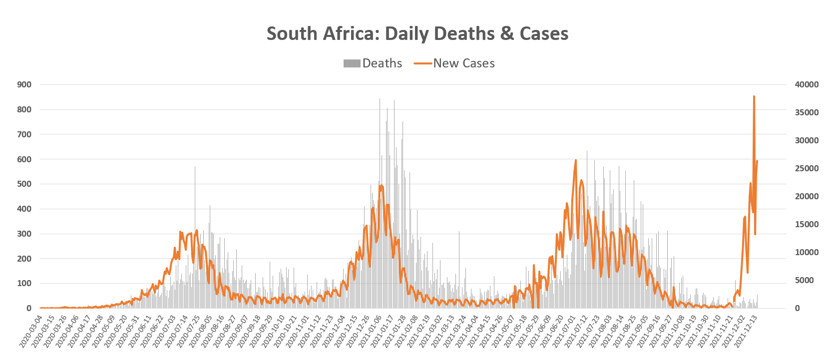
Daily new cases & deaths in South Africa from Covid-19. The chart shows a steep rise in cases recently due to the Omicron variant.
Just a quick glance at the chart (fig. 1) shows a break from the normal pattern of cases & deaths. Deaths do not appear to correspond with cases as they did in the past months: there is a significant gap.
To look at this more closely, we can focus on the right side of the chart.
Fig. 2 Close-up view of New Covid-19 Deaths & Cases in South Africa
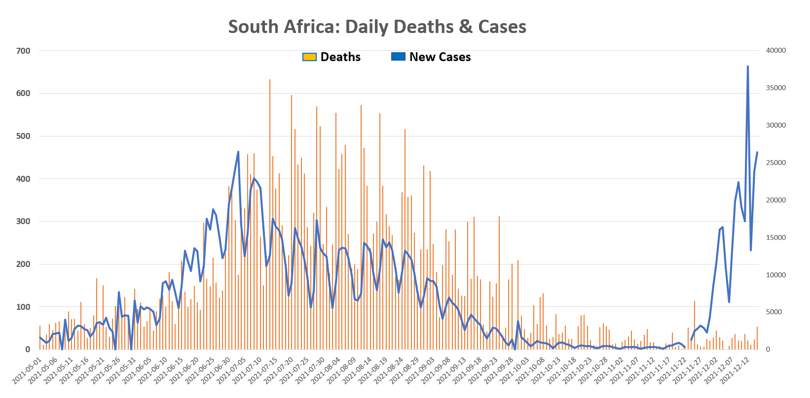
A closer view of the South African Covid-19 daily new cases & deaths. A clear gap between cases & deaths can be seen.
The large gap between deaths & cases can clearly be seen on the enlarged chart and is an unusual pattern compared to the prior history. Prima facie it appears to demonstrate that deaths are not chasing cases as they have done in the past with other variants.
Maybe a more accurate way to measure the data would be to plot the case fatality rate and see how that maps out.
Fig. 3 south Africa: Covid-19 Case Fatality Rate

South African Covid-19 case fatality rate. More recent CFR doesn’t look remarkable compared to prior data.
The CFR has some high spikes that look alarming but are more a product of transient low cases and moderate death numbers in the data of otherwise higher case numbers. Of more interest to us are the recent data, and that they do not appear to be outside prior historical parameters.
But just taking straight death numbers and dividing against cases doesn’t really reflect the natural history of Covid-19 death. As it can take on average 14 - 18.5 days to contract the infection and die, the case and death data should be adjusted by that period and deaths matched to cases eg 14 days prior.
Fig. 4 Unadjusted & Adjusted South African Covid-19 CFR
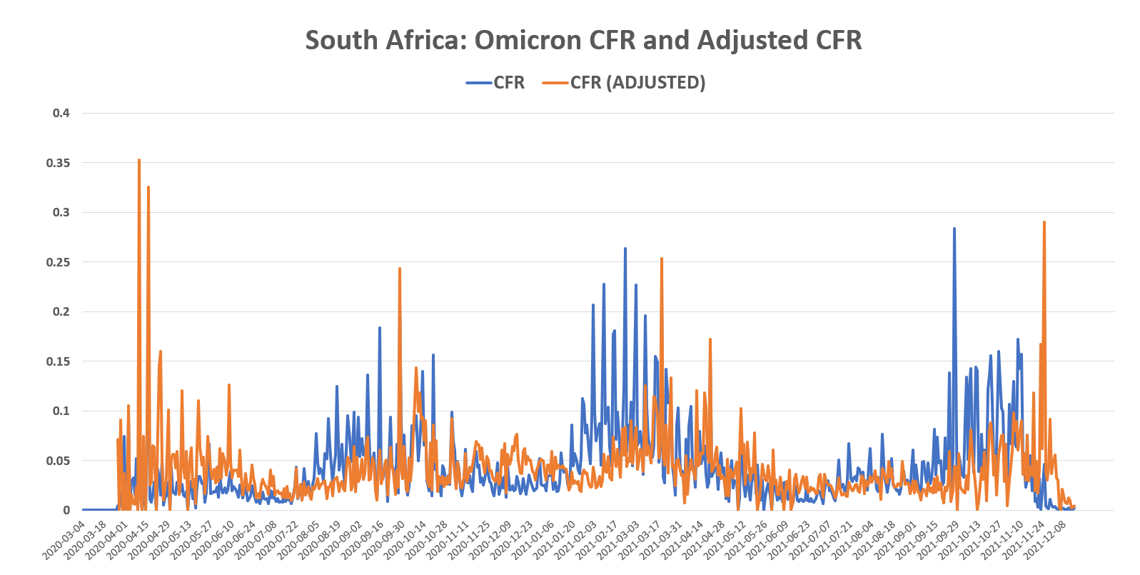
Adjusted South African CFR allowing for a 2 week delay between cases and deaths. The adjustment appears to shift the plot to the right.
The adjusted CFR, although appearing to shift the plot to the right, does not dramatically add any new features. But now we know the CFR (adjusted), and by taking an average of that prior to the recent Omicron outbreak, we get an average CFR for variants prior to Omicron. We can use that information to project forward and calculate the expected deaths (if Omicron’s CFR was the same as prior variant’s) compared to the actual deaths from Omicron.
Fig. 5 Comparison of projected deaths & actual deaths due to Omicron variant in South Africa
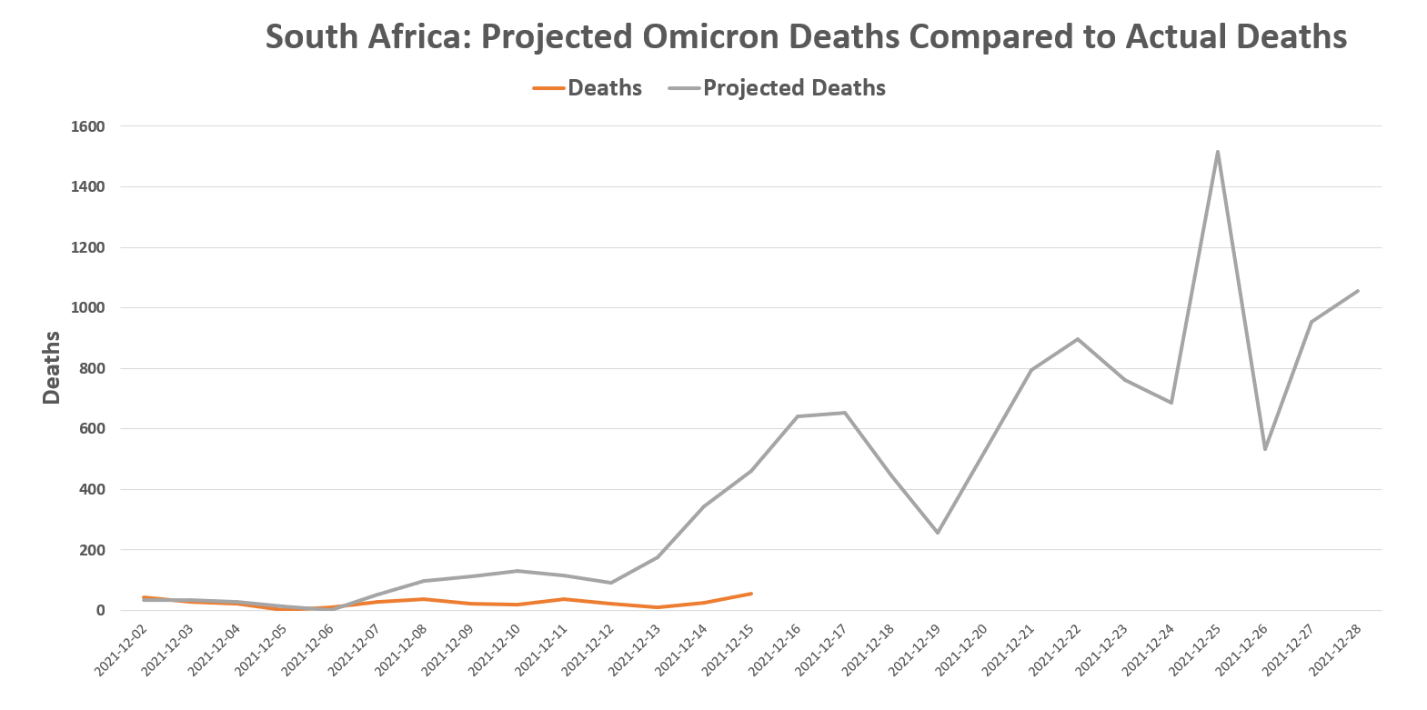
Based on data before Omicron, an average CFR (adjusted) was derived. A comparison projection of expected deaths based on that average CFR of prior variants, and actual deaths due to the Omicron variant, is plotted above. A significant short fall of deaths is demonstrated between the orange line (actual deaths) and the grey line (projected deaths using prior variants’ CFR).
Matching current deaths with cases two weeks prior to calculate a realistic CFR (adjusted), and then applying the average CFR (adjusted) from prior variants to current Covid-19 cases, whose deaths are not expected to have happened yet (remember it can take 2 weeks for death after infection), a future deaths’ projection was plotted.
In addition, a comparison projection was made using the prior variants’ CFR to evaluate the difference in actual deaths with expected deaths.
The results suggest that there is a significant shortfall of deaths due to the Omicron variant compared to prior variants, based on historical data.
If the pattern of Omicron deaths continues and does not ‘catch up’ to the projected deaths, then that may support the claim that Omicron is a mild disease.
However, we may see a ‘catch up’ in deaths over the next days to weeks as depicted by the grey line in figure 5.
Charts, data etc. can be confusing, so let’s summarise.
The recent Omicron Covid-19 cases & deaths’ data do not look like prior variants’ data (fig. 1). It appears that the deaths are not rising to match cases, indeed, there’s a significant gap (fig. 2).
A case fatality ratio was calculated and adjusted to fit the normal pattern of Covid-19 infection & death, which for argument’s sake takes 2 weeks (fig. 4).
That adjusted CFR was averaged from historical data prior to the recent onset of Omicron. That way we have the an average CFR from prior variants.
That averaged, adjusted CFR was applied to current Omicron case numbers to derive the number of deaths we would normally expect to see from prior variants. The result was a significant shortfall of deaths from Omicron (fig. 5).
Will it continue like that or will the deaths ‘catch up’?
Of course, the above analysis is theory and nature bows to no man (even with an Excel spreadsheet).