


The papers are full of interesting headlines
Such as these.

Even in the most optimistic scenario, projected infections could lead to a peak of more than 2,000 daily hospital admissions, with a total of 175,000 hospital admissions and 24,700 deaths between 1 December and 30 April.
The scientists, who advise the government as part of the Scientific Advisory Group for Emergencies (Sage) and the Scientific Pandemic Influenza Group on Modelling (Spi-M), used experimental data to look at how the transmission of Omicron might develop as the country heads into 2022 without more stringent restrictions beyond Boris Johnson’s “plan B”.
And the US.

Then we have this one from the UK.
Darkest days could be behind us as data hint that omicron cases may have peaked
And any possible positive spin, of course, means that the Vaccines and boosters are holding up - apparently.
Are they?

By the way, there many articles like the one above.
What do we make of those headlines?
Confusing?
A Recent Study
Eurosurveillance Journal recently published this study by Brandal et al.

On 30 November 2021 the Norwegian Institute of Public Health (NIPH) was notified by a local laboratory in Oslo of a coronavirus disease (COVID-19) case with suspected severe acute respiratory syndrome coronavirus 2 (SARS-CoV-2) Omicron variant of concern (VOC) (Phylogenetic Assignment of Named Global Outbreak Lineages (Pangolin) designation B.1.1.529 BA.1) infection [1]. The laboratory provided information that the case was likely exposed at a company Christmas party held on 26 November 2021 and that one of the attendees had returned from South Africa on 24 November 2021. The novel SARS-CoV-2 variant Omicron was first detected in samples collected mid-November 2021 in Botswana and South Africa [2]. Here we describe the outbreak and preliminary findings from our epidemiological investigations.
According to the preliminary findings: Most of the cases (n = 79; 98%) and non-cases (n = 27; 93%) were fully vaccinated…The total attack rate for the Omicron variant was 74% (81/110)…
Using the data from that study, which looks pretty bad for the Covid-19 vaccines, even if there was a well powered cohort of 100% unvaccinated that all contracted Omicron to compare with, and completely weighted in favour of the vaccine, the best the vaccine could offer would have been a 26% reduction in risk of infection.
Unfortunately, for that real life study, the infected all appeared to be vaccinated. So we will have to wait and see for a real vaccinated versus unvaccinated comparison.
I don’t think we’ll have to wait long.
What of the UK & US?
Figure 1. UK: Projected Covid-19 Deaths

UK Covid-19 deaths. The graph depicts both raw and smoothed data up to Jan 3rd 2022. Recorded deaths are the blue (raw) & grey (smoothed) lines. The projected deaths’ data are yellow (raw) & brown (smoothed) lines.
UK data with a recent, averaged, adjusted CFR, and smoothed version, demonstrate a possible rise in deaths over the next few weeks.
If cases have peaked, and the CFR does not exceed recent CFRs, then the data indicate a possible ceiling for Covid-19 mortality.
Although, I have chosen a recent CFR comparison for the UK, it will probably include a mixture of Omicron and prior variants’ CFRs. And, therefore, if Omicron continues to be a milder version of Covid-19, we may see less mortality compared to the projection.
Figure 2. US: Projected Covid-19 Deaths

US Covid-19 deaths. The graph depicts both raw and smoothed data. Recorded deaths are the yellow (raw) & brown (smoothed) lines. The projected deaths’ data are grey (raw) & blue (smoothed) lines.
Just as with the UK chart, I have chosen recent, averaged, adjusted CFR data to use in the projections but it will probably include more prior variants’ CFRs than Omicron. Again, we see a projected rise in deaths over the next two weeks. As with the UK, if the US cases peak, and Omicron turns out to be milder, then we should fall short of those projections. However, the geographical considerations of a vast land space such as the US may be harder to predict.
Early data suggest that Omicron has less risk of mortality compared to prior variants but so far is causing high numbers of infected. As we move out of 2021 into 2022, we should see the catch-up of deaths from recent cases due the time lag between infection and death, as depicted above in figures 1 & 2.
If cases have peaked and recent Covid-19 CFRs are reflected in ongoing mortality then the graphs (fig. 1 & 2) may indicate future recorded deaths. Four things may affect those projections.
Omicron was initially reported as a mild disease, and mortality may reflect that.
Omicron CFRs may change as more data are collected.
Case numbers may keep on continuing to rise, albeit with a preceding, transient fall.
Government reactions to Omicron may add to the death toll.
Government increasing mortality
For example, the UK is offloading the elderly from hospitals back into care homes, as they did initially right at the start of the pandemic, when they denied them medical care and caused untold 1000s of unnecessary infections and deaths. Added to by use of end-of-life medication in place of proper medical care.
They have a twist this time, though: they are also sending the sick elderly to hotels, as well.
The UK government has also suspended all routine medical checks on the elderly and new patients in order to administer booster jabs across the country.
One should always be careful when projecting data because no one has a crystal ball. But unless anything left field happens, I feel we are falling foul again of well organised hysteria & propaganda, rather than a deadly pandemic. Thus far, nothing has changed that view which I have held from the beginning.
A reminder from the past
Figure 3 UK Flu deaths
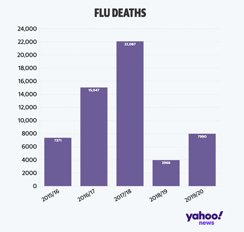
UK flu deaths by year.
I don’t remember much hysteria, vaccine passports and masks in 2017/18.
Figure 4. Recent mortality data from S. Africa
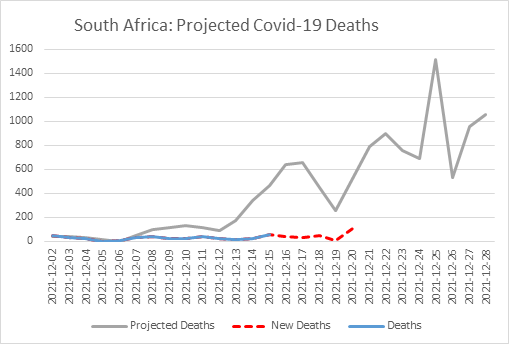
Deaths from Covid-19. Recorded deaths up to 15th Dec 2021 (blue line); and recent deaths updated since the first publication of this chart, to 20th Dec 2021 (red dashed line); and projected deaths based on most recent averaged, adjusted CFRs (grey line).
Thus far, South Africa is not meeting an expected mortality projection based on recent CFRs data.
Figure 5. UK Covid-19 cases & deaths

Recent UK data demonstrate a break in the normal pattern of deaths chasing cases.
Like the S. African data we have discussed before in Omicron - back to the future (fig. 1), UK data demonstrate the same pattern break, with recent deaths not matching the rise in cases, suggesting a milder disease.
Figure 6. UK adjusted case fatality rates

UK daily adjusted case fatality rate (CFR) to allow for lag between infection and death.
What would you say in the future
If you had to describe to someone in the future what happened here, now in 2020/21. Would you describe the coordinated actions of the WHO and governments as one heroic, global effort to save Humanity from a deadly pandemic?
Or would you say something else?
I know what I’d say…and some of you would probably agree with me..
I think by now, whether we know for sure what’s really going on or not.
We all know deep in our hearts, whatever it is our governments are attempting to do,
it has nothing to do with healthcare.